Your resume’s design can be the deciding factor between landing an interview and disappearing into an applicant tracking system. The most effective resume design ideas balance visual appeal with scanning efficiency, using strategic white space, hierarchy through typography, and selective color to guide recruiters’ eyes to your strongest qualifications in under six seconds.
In 2026’s competitive job market, particularly within high-tech industries, hiring managers review hundreds of applications for each position. A well-designed resume isn’t about artistic flair or standing out with novelty. It’s about deliberate information architecture that makes your value proposition impossible to miss. Research from recruitment platforms shows that structured visual design increases callback rates by 28% compared to text-heavy, uniform layouts.
The challenge lies in creating a design that passes both automated screening systems and human review. Too minimal, and you waste precious space that could showcase technical skills or project outcomes. Too elaborate, and ATS software may reject your application before a recruiter ever sees it. The eight design strategies that follow address this balance directly, giving you specific, implementable approaches that work across industries while remaining adaptable to your experience level and target role. Each idea comes with clear implementation guidance and examples of when to deploy it for maximum impact.
What Makes a Resume Design Stand Out to Employers
Before you implement any design element, understand what recruiters actually evaluate when they scan your resume. At Northern Lights Canada, we review hundreds of applications weekly, and the resumes that advance share four critical qualities: immediate readability, technical compatibility with applicant tracking systems, professional polish appropriate to the industry, and strategic visual hierarchy that highlights relevant qualifications.
The six-second rule governs initial screening. Hiring managers in high-tech and other competitive sectors make split-second decisions about whether your resume warrants a full read. Clean formatting, logical section flow, and prominent achievement statements determine whether you pass this first gate. Your design must guide the eye to your strongest selling points without requiring effort to decode.
ATS compatibility remains non-negotiable. Most employers use HR technology to filter applications before human review, meaning overly creative designs with text boxes, tables, or graphics can render your qualifications invisible. The eight ideas we’ve selected balance visual impact with parsing reliability.
Industry context matters significantly. A software engineer’s resume for a startup can embrace more contemporary design elements than a financial analyst’s application to a conservative firm. We’ve chosen ideas that adapt across sectors while maintaining professional standards, allowing you to calibrate creativity to your target employer’s culture.
1. Strategic White Space: The Minimalist Advantage

White space isn’t empty space, it’s a design tool that makes hiring managers want to read your resume instead of skim past it. When you build margins of at least 0.75 inches on all sides and use 1.15 to 1.5 line spacing, you create visual breathing room that reduces eye strain and signals professionalism. A recruiter scanning 50 resumes in an hour will unconsciously favor the one that doesn’t feel crammed.
Strategic spacing between sections (14-18 points) creates natural breaks that guide the eye from one area to the next without conscious effort. This matters because hiring managers spend six seconds on an initial review, your layout needs to do the navigation work for them. A dense, text-heavy resume with minimal margins triggers an immediate “too much work to read” response, regardless of your qualifications.
The minimalist advantage extends beyond readability. Clean spacing projects confidence and selectivity, you’re presenting curated accomplishments rather than cramming every detail onto the page. It also improves ATS compatibility since parsing software relies on clear section boundaries and consistent formatting to extract information correctly.
Aim for 40-50% white space across your entire resume. If your page looks crowded, you’re likely listing duties instead of showcasing achievements. Edit ruthlessly, trim filler phrases, and let the space work as hard as your words.
2. Two-Column Layouts for Maximum Information Density
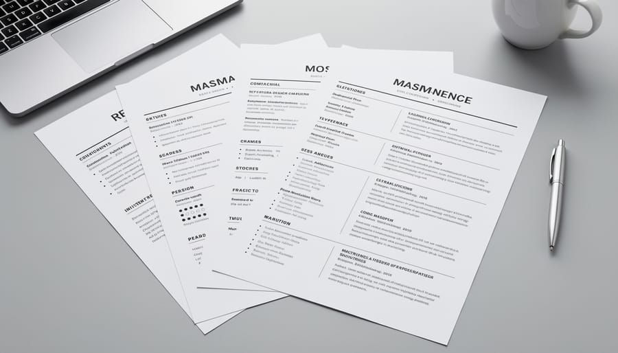
Two-column resume layouts transform how you present information by dividing the page into distinct zones, typically a narrow sidebar (25-30% of page width) and a wider main column. This structure lets you pack more relevant details into a single page while maintaining visual clarity that hiring managers appreciate during their initial scan.
The sidebar excels at housing static, scannable information: technical skills, certifications, languages, software proficiencies, and education credentials. These elements don’t require narrative explanation, so they work perfectly in a condensed vertical list format. When an HR professional at a tech company needs to verify you have Python, AWS, and Agile certifications, they can spot these instantly in a well-organized sidebar without hunting through dense paragraph text.
Reserve your main column for experience and achievements, the content that demands space to breathe. This wider section accommodates bullet points detailing your accomplishments, quantified results, and project descriptions that demonstrate your value. The asymmetric layout creates natural visual hierarchy: the sidebar says “here’s what I know,” while the main column proves “here’s what I’ve done with that knowledge.”
Most ATS systems parse two-column formats successfully if you avoid text boxes, tables, or complex graphics. Stick with simple column divisions created through margins and alignment. Test your layout by copying the text into a plain text editor, if the content order remains logical and readable, the design will likely survive ATS screening while still impressing human reviewers with its efficient use of space.
3. Strategic Color Accents That Signal Professionalism
Color transforms a resume from a plain text document into a branded professional statement, but only when applied with precision. A single, well-chosen accent color creates visual hierarchy, guides the reader’s eye to key information, and demonstrates design sophistication without compromising credibility.
The most effective approach uses one accent color for specific elements: section headings, your name, horizontal dividers, or bullet points. This consistency creates cohesion across the page and signals intentionality rather than haphazard decoration. Navy blue, deep teal, charcoal gray, or burgundy project confidence and work across nearly every industry. These colors maintain readability when printed in grayscale and pass through ATS systems without issues.
Industry context matters significantly. High-tech companies, creative agencies, and startups respond well to bolder choices like electric blue, vibrant orange, or modern purple that communicate innovation and cultural fit. Finance, law, healthcare, and government positions demand restraint: stick with conservative navy, dark green, or subtle gray that reinforces traditional professionalism.
Avoid red, which reads as aggressive or error-focused in many corporate contexts. Skip pastels entirely, they appear washed out on screen and unprofessional in competitive fields. Never use more than two colors total; multiple accent colors create visual noise that undermines your message.
Test your color choice by printing a draft and viewing it on different devices. Your accent should enhance readability, not compete with your content. When recruiters spend six seconds scanning your resume, color should direct their attention to your strongest qualifications, not distract from them.
4. Custom Section Icons for Visual Navigation
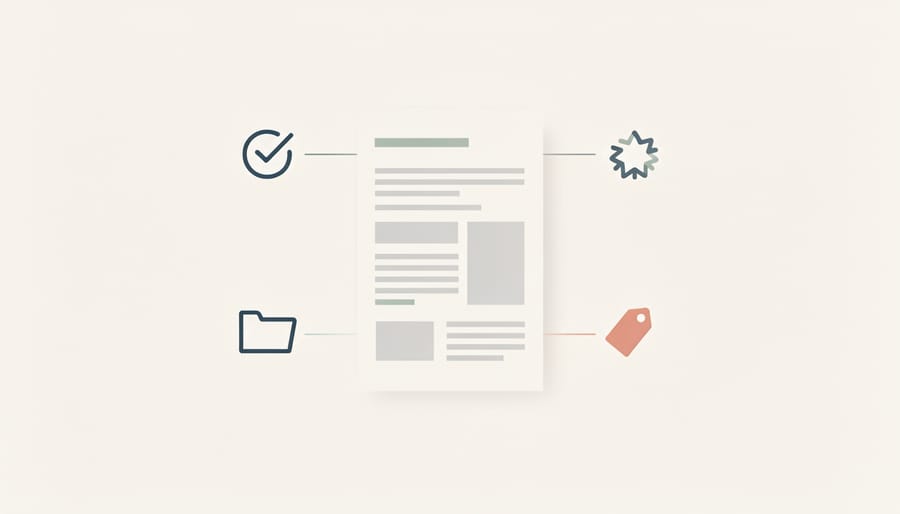
Small visual anchors can transform how quickly a hiring manager finds information on your resume. Custom section icons, simple graphic markers next to headings like “Experience,” “Education,” or “Skills”, create instant recognition points that guide the eye through your document in seconds.
The key is restraint. A briefcase icon beside your work history or a graduation cap next to your education credentials works because these symbols carry universal meaning. They reduce the mental effort required to navigate your resume, which matters when recruiters spend less than ten seconds on initial scans. Icons should be monochromatic, sized proportionally to your heading text (typically 16-20 pixels), and positioned consistently on the left of each section title.
When icons add genuine value: technical skills sections benefit from gear or chip symbols; certifications pair well with badge graphics; language proficiencies can use small flag or globe markers. These visual cues help differentiate content categories at a glance.
When they become clutter: decorative stars, multiple colors, or overly detailed illustrations distract rather than clarify. Similarly, avoid icons that require interpretation, abstract shapes or industry-specific symbols that aren’t immediately obvious waste cognitive resources.
The ATS concern is real but manageable. Icons saved as images won’t be parsed by applicant tracking systems, so they’re purely visual aids for human readers. Keep your section headings as actual text alongside the icons, ensuring the ATS can still categorize your information correctly. Test by copying your resume content into plain text, if the structure remains clear without graphics, you’ve achieved the right balance.
5. Achievement-First Formatting with Visual Hierarchy
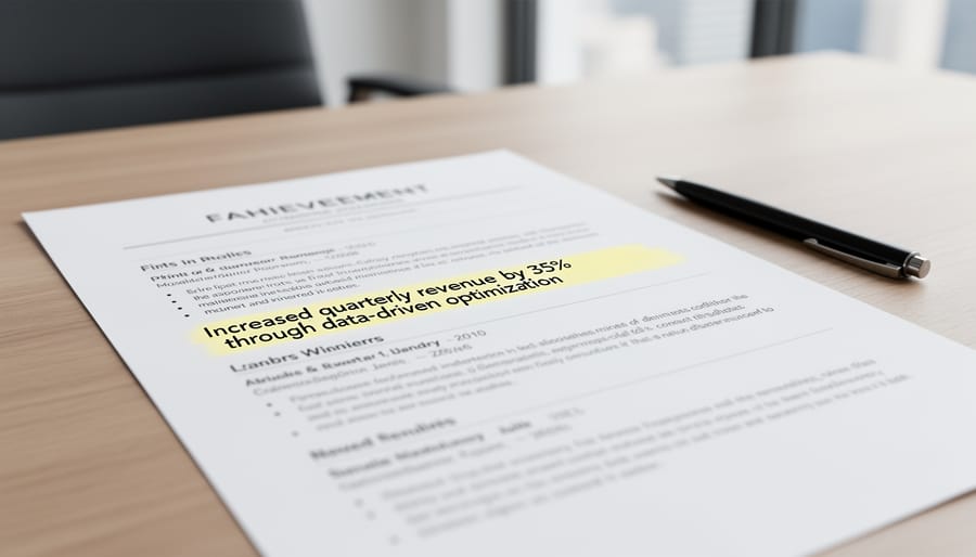
Recruiters make split-second decisions during their initial resume scan, and achievement-first formatting ensures they see your most compelling evidence first. Rather than burying accomplishments in dense paragraph blocks under each job title, this design approach uses typographic weight and size to pull quantified results forward, creating immediate visual impact that differentiates high performers from task listers.
Start with bold formatting for specific metrics and outcomes: “Increased revenue by 47%” or “Reduced deployment time from 6 hours to 45 minutes” should visually pop off the page before a recruiter reads the surrounding context. Use a slightly larger font size (1-2 points) or heavier weight for these result statements compared to the descriptive text that follows. This hierarchy guides the eye to proof of impact rather than generic duty descriptions.
Structure each role with accomplishments listed first, followed by relevant responsibilities only if space permits. Lead with bullet points that begin with strong action verbs and immediately quantify the result: “Generated $2.3M in new business” reads more powerfully than “Responsible for business development activities that contributed to revenue growth.” The former uses hierarchy to spotlight the number; the latter hides it in explanatory text.
Consider using a two-tier bullet system where major achievements appear as primary bullets with heavier visual weight, and supporting details or methods appear as lighter sub-bullets. This creates a scannable outline structure that lets hiring managers grasp your value proposition at a glance, then dive deeper into how you delivered those results if your headline accomplishments intrigue them. The visual distinction between levels prevents the flat, monotonous appearance that makes all information seem equally important (and therefore equally forgettable).
6. Professional Typography Pairing for Readability
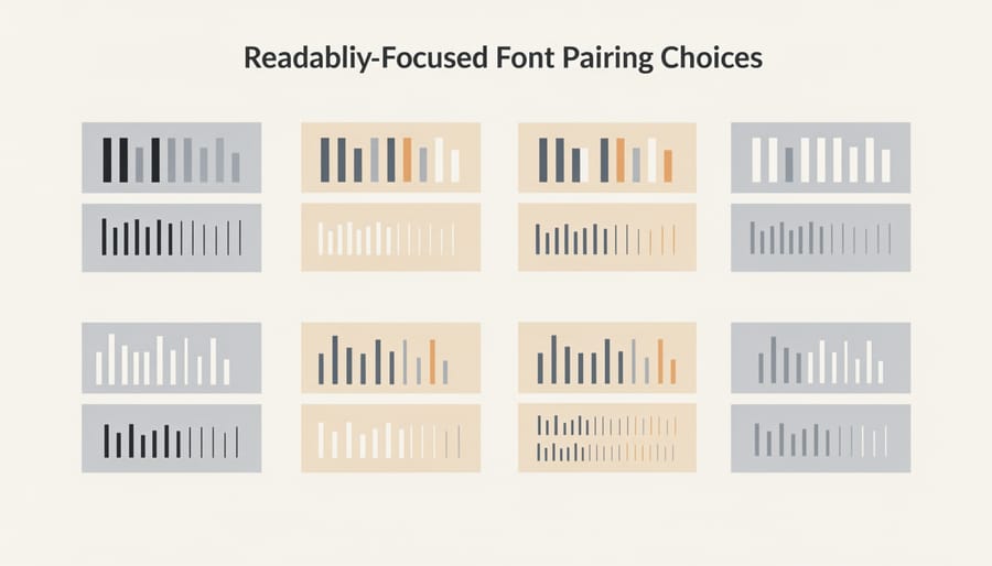
Typography makes or breaks resume readability in the hiring manager’s quick scan. The right font pairing signals attention to detail without drawing attention to itself.
Start with a clean sans-serif for your body text, Calibri, Helvetica, or Arial all parse flawlessly through ATS systems while projecting modern professionalism. These fonts were designed for screen readability, which matters since most resumes get reviewed digitally before anyone prints them. Keep body text at 10.5 to 11 points for comfortable reading without squinting.
For section headings, you have two paths. You can stick with the same sans-serif in a heavier weight (bold or semi-bold) for a unified, contemporary look. Or pair your sans-serif body with a subtle serif like Georgia or Garamond for headings, this creates visual distinction while maintaining professionalism. Serif headings at 12 to 14 points establish clear hierarchy without shouting.
Skip Times New Roman, Courier, and Comic Sans entirely. Times reads as outdated (it was designed for 1932 newsprint), Courier suggests you don’t understand digital documents, and Comic Sans kills credibility instantly. Avoid decorative or script fonts for any resume element, even your name, they’re difficult to read and often fail ATS parsing.
Use exactly two fonts maximum: one for headings, one for body text. Mixing three or more creates visual chaos. Consistency matters more than creativity when typography choices determine whether someone reads past your header.
7. Infographic Resume Sections for Technical Skills
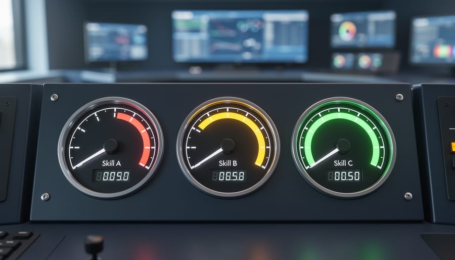
Visual skill indicators, horizontal bars, star ratings, or percentage-filled circles, transform dense technical skill lists into scannable graphics that let hiring managers assess your capabilities at a glance. For high-tech roles where candidates might list 15-20 programming languages, frameworks, or platforms, these elements create immediate visual hierarchy between expert-level and working-knowledge skills.
The most effective approach uses simple horizontal bars with proficiency levels (Beginner, Intermediate, Advanced, Expert) rather than numeric percentages, which can appear arbitrary. A full bar for Python alongside a half-bar for R immediately communicates where you’re strongest without forcing the reader to decode what “75%” actually means in practice. This visual shorthand proves particularly valuable when recruiters spend those critical first seconds determining if you match their technical stack.
However, infographic elements demand careful implementation. Many ATS systems parse skills as plain text, so your visual indicators must supplement, not replace, a traditional skills section that lists technologies in readable text format. The safest structure places a clean text list of skills in your main resume body, then adds visual proficiency bars in a sidebar or supplementary section that recruiters see but ATS can safely ignore.
Limit visual skill indicators to truly measurable technical competencies. Rating “communication skills” or “leadership” with bars undermines credibility because these soft skills resist quantification. Reserve graphics for concrete, testable abilities where proficiency levels carry objective meaning: programming languages, software platforms, technical certifications, or specialized equipment operation. The contrast between your expert-level skills and developing competencies should guide hiring conversations about where you’ll contribute immediately versus where you’re positioned to grow.
8. Personal Branding Elements and Header Design
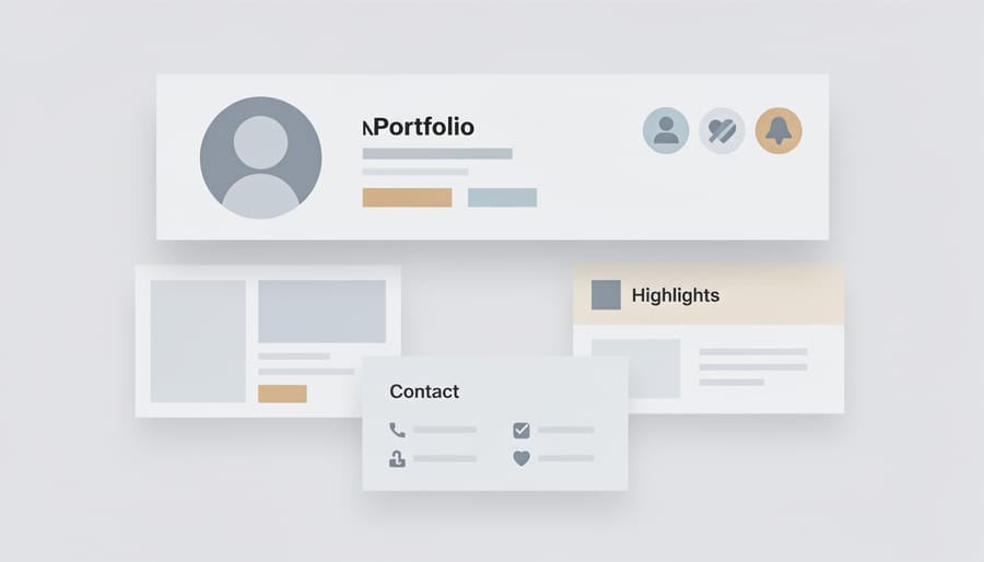
Your resume header is prime real estate, it’s the first thing a hiring manager sees, and it sets the tone for your entire application. A well-designed header creates immediate visual impact while ensuring recruiters can contact you without hunting for information.
Start with your name displayed prominently using a larger, bold font (18-24 point), positioned at the top center or top left. This isn’t the place for modesty, your name should be the largest text element on the page. Directly below, streamline your contact information in a single line or compact block: phone number, professional email address, LinkedIn URL, and location (city and province are sufficient; full street addresses are outdated). Use separators like vertical bars (|) or bullet points (•) to create visual breathing room between items.
Consider adding a one-line professional tagline that captures your value proposition: “Senior Data Analyst | Python & Machine Learning Specialist” or “Digital Marketing Strategist Driving ROI Through Data-Driven Campaigns.” This immediately communicates your specialty and supports keyword alignment for ATS systems. Keep it factual and specific rather than generic (“Experienced professional seeking opportunities”).
If space allows, a 2-3 sentence professional summary directly beneath your header can work, but ensure it adds genuine value. Avoid vague statements like “detail-oriented team player”, instead, quantify your experience and highlight specialized expertise relevant to your target role. The header should feel cohesive with your overall design: maintain consistent colors, fonts, and spacing that you’ve established throughout the document.
Common Resume Design Mistakes That Cost You Interviews
Even the most creative resume design ideas fail if you commit these fundamental errors that recruiters see constantly. Northern Lights Canada’s hiring managers review hundreds of applications for high-tech and private-sector hiring and these mistakes instantly undermine otherwise qualified candidates:
- Graphics-heavy designs that ATS systems cannot parse, causing your application to be auto-rejected before human review
- Inconsistent formatting where font sizes, bullet styles, or spacing vary randomly across sections
- Industry misalignment, such as overly artistic layouts for conservative finance roles or generic templates for creative positions
- Excessive color use that distracts from content or prints poorly in black-and-white
- Tables and text boxes that scramble when parsed by applicant tracking software
- Tiny fonts below 10 points that sacrifice readability for cramming in more content
The pattern here is clear: design must enhance communication, not obstruct it. Your resume’s visual choices should guide the reader’s eye toward your strongest qualifications while maintaining technical compatibility with hiring systems. If a design element does not serve a specific purpose, improving scannability, emphasizing achievements, or demonstrating industry awareness, remove it. Function always precedes form in professional documents.
Frequently Asked Questions About Creative Resume Design
Will creative design hurt my ATS score?
Not if you follow core formatting principles. Modern ATS systems handle clean, well-structured designs effectively, the real compatibility issues arise from text boxes, tables, headers/footers, and unusual fonts. The design ideas outlined here (white space, two-column layouts, strategic color, professional typography) parse correctly in applicant tracking systems because they rely on standard formatting rather than graphics-heavy templates. Submit your resume as a .docx or PDF file (check the job posting for preference), use standard section headings like “Experience” and “Education,” and avoid embedding critical information in images or complex tables.
What file format is best for creative resumes?
PDF preserves your design across all devices and operating systems, ensuring hiring managers see exactly what you intended. However, some older ATS platforms struggle with PDFs, so read application instructions carefully. When the job posting doesn’t specify, PDF is the safer choice for creative designs because fonts, spacing, and colors remain intact. Keep an unformatted .docx version as backup for systems that explicitly request Word files. Northern Lights Canada recommends having both formats ready, PDF as your default submission, Word when specifically required.
How creative is too creative for high-tech roles?
For high-tech positions, aim for modern and polished rather than artistic or unconventional. Clean typography, strategic color accents, and well-organized layouts signal professionalism; illustrations, unusual shapes, or overly decorative elements risk appearing unprofessional in corporate tech environments.
Should I have multiple resume designs for different industries?
Yes, tailoring your design to industry expectations significantly improves your chances. A creative design with bold colors might work for startups and digital agencies, while traditional sectors like finance or healthcare require more conservative formatting with minimal color and conventional layouts.
Can I use templates from online resume builders?
Templates provide a helpful starting point, but customize them to avoid the “cookie-cutter” look that hiring managers recognize instantly. Adjust colors, typography, and spacing to reflect your personal brand while maintaining the template’s structural advantages.
Do hiring managers actually notice resume design?
Absolutely, especially during the initial 6-10 second scan where visual hierarchy determines whether they continue reading. Northern Lights Canada’s recruitment team consistently reports that well-designed resumes with clear formatting and strategic emphasis on achievements receive longer review times than dense, poorly formatted alternatives.
The key consideration across all these questions is balance. Creative resume design should enhance your qualifications, not overshadow them. Your design choices communicate attention to detail, understanding of professional standards, and respect for the hiring manager’s time, all qualities employers value regardless of industry. When you submit a thoughtfully designed resume that’s both visually appealing and functionally sound, you demonstrate the same strategic thinking that makes you valuable as an employee.
The eight design strategies we’ve covered share a common thread: they enhance your resume’s effectiveness without sacrificing its core function. Strategic white space, thoughtful typography, achievement-first formatting, and professional color choices work together to create a document that hiring managers actually want to read. Your resume isn’t just a list of credentials, it’s your first opportunity to demonstrate how you think, communicate, and understand professional expectations.
The most successful resumes strike a balance. They catch attention through clean, modern design while ensuring every visual choice serves a purpose. A two-column layout increases information density. Custom icons improve navigation. Color accents guide the eye to what matters most. These aren’t decorative flourishes; they’re strategic tools that help busy recruiters process your qualifications quickly and favorably.
As you refine your resume design, remember that different industries reward different levels of creativity. What works brilliantly for a UX designer might feel excessive for a financial analyst. The key is understanding your target employer’s culture and expectations, then designing accordingly.
At Northern Lights Canada, we’ve seen how thoughtful presentation transforms opportunities for job seekers across high-tech and traditional industries alike. Your resume design should reflect both your professional capabilities and your attention to detail, qualities every employer values.